


When The Natural Rug Store was founded in 2006, the company was one of the first e-commerce stores to successfully employ online product customisation and visualisation. The product range was extensive and refreshingly luxurious and it was felt this should be paramount in their messaging. At the time natural products possessed a definite earthy vernacular. We wanted to challenge this approach and the unexpected use of colour with their strong pink played a large part in this. This shows one of the alternate configurations of their wordmark developed for placement within narrower spaces.
This is the primary configuration of The Natural Rug Store wordmark. Based in Birmingham, UK a variant of the Baskerville typeface; designed by John Baskerville in Birmingham, England was chosen to both communicate their roots but also to convey a sense of elegance and luxury. The organic ornamentation added to three letterforms further reinforces this while hinting at the living origins of the natural materials used.
ITC New Baskerville was paired with the contrasting sans-serif Myriad Pro. Designed by Robert Slimbach and Carol Twombly with Fred Brady and Christopher Slye it possesses beautiful humanistic proportions and excellent readability.
This created a broad typographic palette suitable for the wide range of applications my client required.
Two Wood Type Ornaments were also included in the brand palette; one of which is shown here. The letterhead was beautifully litho printed with an additional reverse print to create a visual surprise for readers of my clients correspondence. Great care was taken with the tone of the grey; too dark and it would be distracting with unwanted show-through but too light and it would risk looking unintentional. The printers did an exceptional job.
Visitors to the site were encouraged to order sample packs to match colours first hand and as such they played a large part in my clients sales conversion process. Compliment slips were similarly carefully treated for this reason. My clients have received many favourable comments regarding the presentation and design of these packs through the years.
Business cards were carefully blind embossed with the ornament featured on the letterheads and compliment slips to encourage their retention as something special by their recipients. Two colours were produced with the intention one would be retained and the other shared.
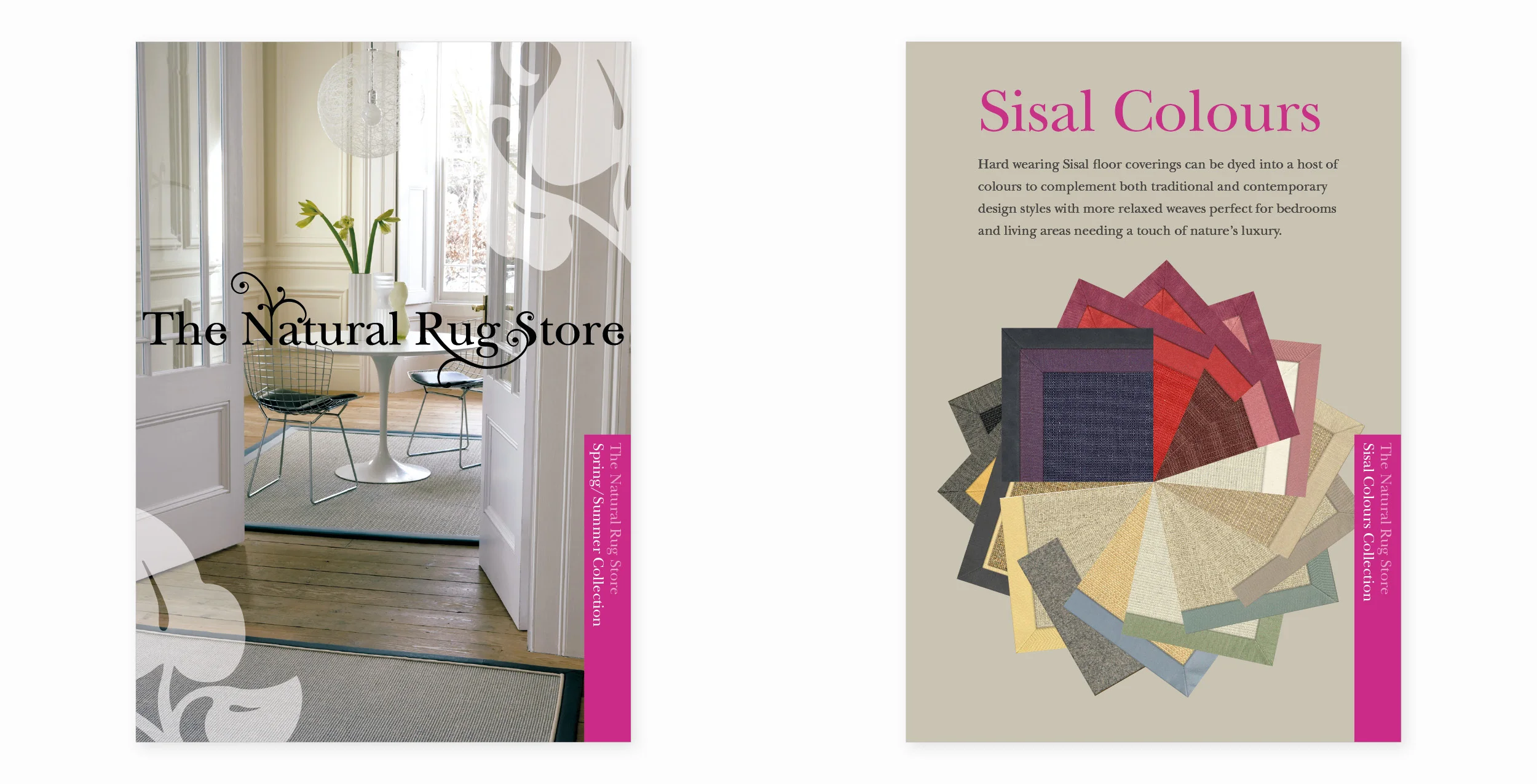
Front cover and section divider from The Natural Rug Store’s new season e-brochures. The Sisal colour wheel was created to show the vast array of colour choices available in that material due to its natural affinity for dye.